
About
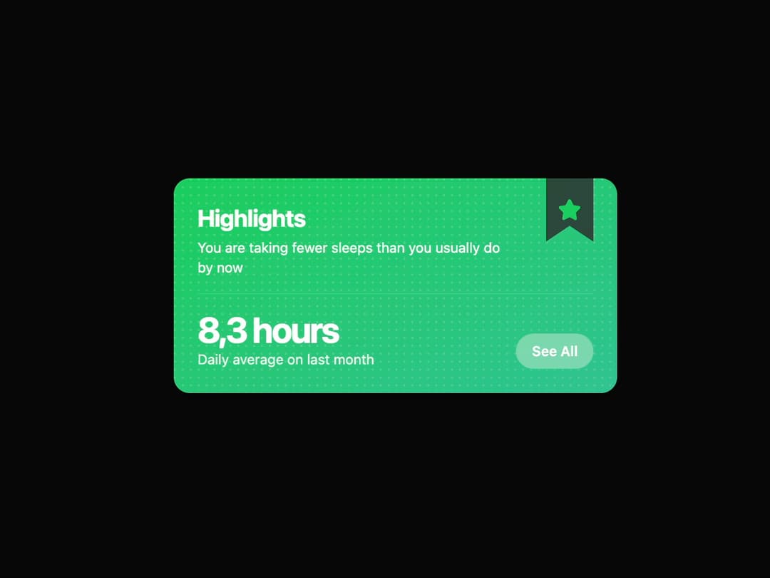
Highlight Card A visually rich card component designed to draw attention to key metrics or highlights. It features a gradient background with a subtle dot pattern, a distinctive bookmark-style icon holder, and smooth animations powered by framer-motion. The component is fully customizable through props, allowing for easy reuse throughout an application.
Built with React and Tailwind. Copy the prompt and paste it into Claude Code, Cursor or Lovable: your agent adds Card to your project and fits it to your theme.
Code
How Card is used: the demo's code. The component's own source comes with a free account.
Usage.tsx
import { HighlightCard } from "@/components/ui/card-5";
import { Star } from "lucide-react"; // Using lucide-react for icons

export default function HighlightCardDemo() {
  return (
    <div className="flex h-full w-full items-center justify-center bg-background p-4">
      <HighlightCard
        title="Highlights"
        description="You are taking fewer sleeps than you usually do by now"
        metricValue="8,3 hours"
        metricLabel="Daily average on last month"
        buttonText="See All"
        onButtonClick={() => alert("'See All' button clicked!")}
        icon={<Star className="h-6 w-6" fill="currentColor" />}
      />
    </div>
  );
}
Dependencies
More by LaviKatiyar
View all
Hero Section
801
Cards
564
Service Card
546
Card
505
Alert Toast
481
Bento Grid
381
Freelancer Profile Card
358
Referral Card
289
More in Cards
View all

Statistics Card 2
264

Course Design Cards
1.1K
Card
70
Stats cards with links
39
The Item one
3

Card Studio
7
Statistics Card 7
292

Item
10
